Background
One of my most impactful projects at Buzz Points was to take on a full redesign of what was our existing iOS consumer application. The goal of the redesign was threefold: 1 ) to include features only available on our web application to create a consistent user experience across all our platforms 2 ) create a way for everyday consumers to easily discover and earn rewards at local businesses near them and 3 ) to improve overall user experience and update UI to embody Buzz Points branding.
I worked closely with a team of 2 product managers and 5 developers over the span of 5 months to release the current version of the Buzz Points application.
The redesigned application increased our mobile traffic by 30%.
What I worked on:
- Wireframed early prototypes
- Created high fidelity designs
- Created functional specifications for development
- Coordinated sprint goals and application launch
Requirements & Constraints
Prior to beginning work on the redesign, two of our product managers and myself held many sessions with our internal stakeholders, including board members, to discuss the vision and strategy for the redesign. These sessions were also used to understand the requirements and business constraints that we were working with.
A mind-mapping exercise we conducted with our stakeholders that mapped out the user's mobile experience.
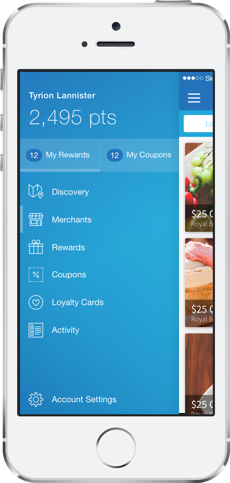
Discovery Feed
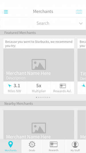
One of the main goals of the mobile redesign was to include features only present on web. What we didn't want to do was simply stuff the same features into mobile and call it a day. Instead, we wanted to include the features in a way that would optimize the way our consumers interact with our program on a mobile device. Our online application showcases many directories, products, and ways in which our users can interact with our program. For the mobile redesign, I wanted to take the parts of our program that our users interact with the most and highlight them. Some of the most common interactions include buying/using rewards, checking activity, and browsing coupons. On the web, these would all be separate directories and locations. For mobile, I wanted to centralize all of the most common interactions in one place. One of the ideas was the idea of a discovery "feed". Similar to Facebook's News Feed, the discovery feed would only surface up information that is relevant to the user's spending activity and location. Unlike the web application, where the user would have to go to the rewards directory to view offers, and the coupon directory to view coupons, the discovery feed would allow users to browse rewards and coupons that are both relevant to them and nearby all in one place. Certain user activities, such as buying a reward or completing a loyalty card would also show up in the discovery feed, giving the user a quick view of their interaction with our program.
One of the biggest challenges with the discovery feed was figuring out a way to include large amounts of information in a way that was easily digestible.
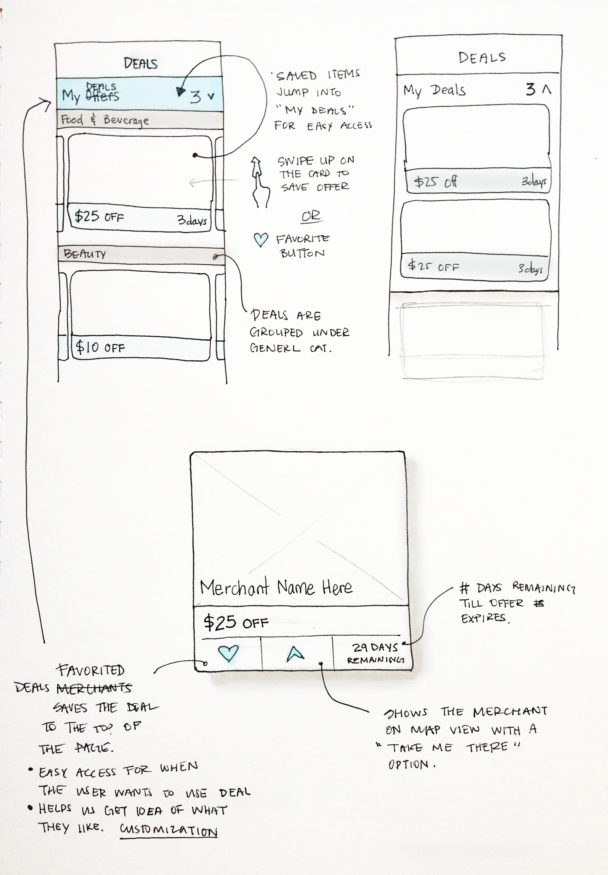
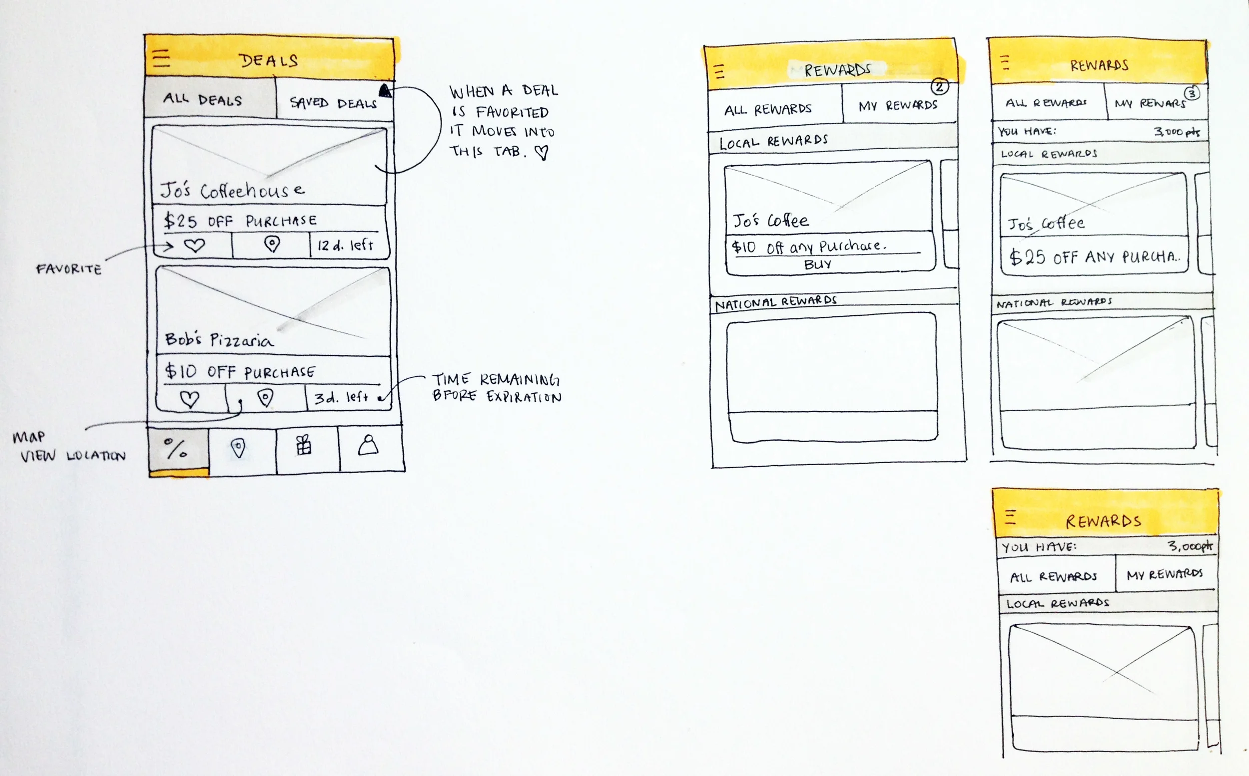
The above wireframes were exploring different interactions and ways of presenting large amounts of information within the discovery feed.
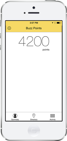
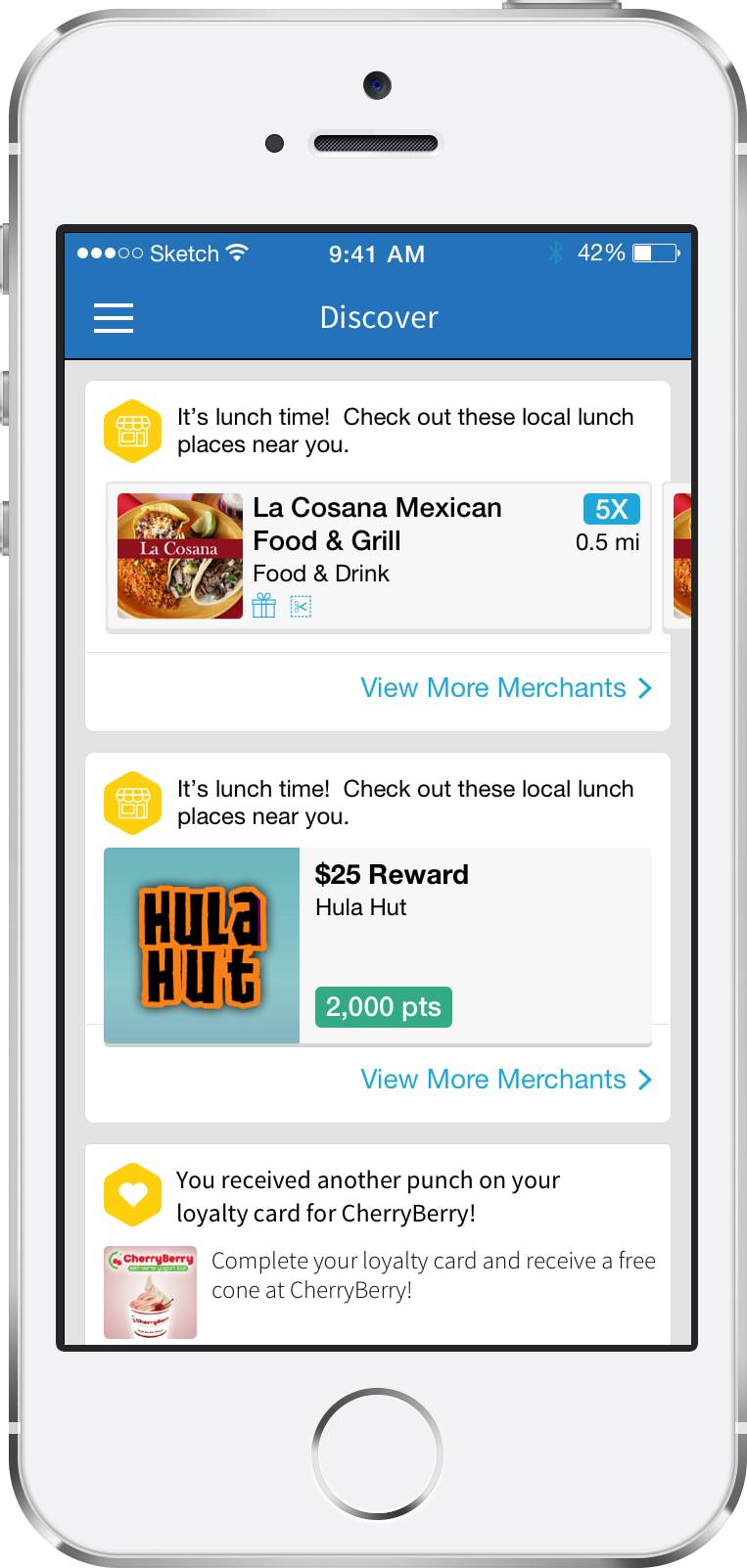
The end result was a feed that grouped similar information into buckets that would be accessed through horizontal scrolling. Since the idea of the discovery feed is to aggregate the parts of our application that our users interact with the most, we decided to make it the home page of the application. This allows our users to easily access their favorite program features.
The screenshots to the left show what the home page of the application looked like before (left) and after (right). Prior to the redesign, the home screen did not have any actionable items.
User Onboarding
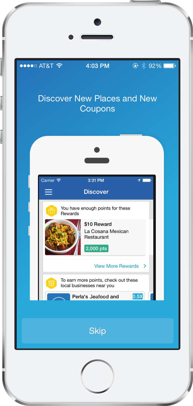
Prior to the redesign, the Buzz Points iOS platform only provided the users an option to log in to the application. For the redesign, it was important that we allow users to sign up through the application, just like they were able to on the web. Building out a sign up functionality also meant building out an onboarding experience that would educate new users on the Buzz Points program. A secondary goal of the onboarding experience was to introduce existing Buzz Points users to the new mobile application. Due to the nature of our program, our users are invited to join the Buzz Points program through a promotional email from their local financial institutions. Because of this, almost all new users already have some background knowledge of Buzz Points prior to downloading our application. For this reason, I decided to keep the onboarding short and sweet. I focused on highlighting the major features on mobile while still educating about the program. The screenshots below show the new onboarding flow.


Launch Coordination
In addition to working on the design and UX for the redesign, I also provided functional specifications and worked with our developers to make iterations on the design. I attended weekly sprint planning meetings to provide product direction and discuss requirements. It was very much a team effort between product and development to bring this application to the app store.
Retrospective
Looking back on project, there are a few things I would have liked to have done differently:
User Research: One of the major goals of the redesign was to mirror features that were already existing on web and not to build out new features. Because of this, our team was not given many resources to conduct user research. I would have liked to have spoken to some of our users to better understand how they utilize our program offerings as well as their general familiarity with mobile applications.
Iterative Designs: The launch of the redesigned application was very much a big bang launch. If I could go back and do this project again, i would have liked to first put out an MVP and then released iterative designs on top of it.